Sunday 30 October 2011

Modelling with R: part 5

In our exercise of learning modelling in R, we have till now succeeded in doing the following:

  1. Importing the data
  2. Preparing and transforming the data
  3. Running a logistic regression
  4. Creating a decision tree
Specifically, we created a decision tree using the rpart package. The decision tree was built with no priors and gave an AUC value of 0.73475 as opposed to 0.80493 given by the logistic regression. So here the logistic regression outperforms the recursive partitioning methodology of the rpart package. In this post we will try to see how we can improve over the current performance level of our decision tree. As a way to gauge our performance in the future, we can consider the AUC of the logistic regression as a minimum benchmark over which we need to improve. So let's get started.

 ## 2.2.2: Decision tree with priors  ##

t1.prior <- rpart(default ~ 
                          amt.fac + 
                          age.fac + 
                          duration +
                          chk_acct +
                          history +
                          purpose +
                          sav_acct +
                          employment +
                          install_rate + 
                          pstatus +
                          other_debtor +
                          time_resid +
                          property +
                          other_install + 
                          housing +
                          other_credits +
                          job +
                          num_depend + 
                          telephone + 
                          foreign
                                , data = dev, parms = list(prior = c(0.9, 0.1)))
# Not the difference in the commands for a tree with priors and a tree without one. Here we need to specify the priors along with the formula in the rpart() function command.


Before we go further it is important to understand what "priors" exactly are. I initially did not understand the concept of priors until I read this document. You need not go through the entire document. I have made a little summary for myself that might help.

Simply put, priors are nothing but a weighing scheme. They specify the weight that we put on the overall level of the dependent variable. Technically, all trees are built with priors. In cases where priors are not specified, they are automatically taken to be proportional response rate, i.e, for each class they are proportional to the to the number of records in that class.

Take for example our data set. The dependent variable has two categories - 0 and 1. There are 300 1s and 700 0s, so the response rate is about 30% (300/(700 +300)). Then most decision trees will automatically apply priors of 30% and 70% to the respective classes. Now a simple decision tree tries to maximize the number of cases it classifies correctly and hence a lot of effort will concentrated on classifying the non-defaulters instead of the defaulters. This is because even if we incorrectly classify all the bad loans we will be wrong 30% of the time as opposed to 70% of time if we incorrectly classify the non-defaulters. As mentioned in the document, it is important to note that such a model will be, "literally accurate but practically worthless." 

How can we then deal with such situations. There are three possible options here
  1. Increase the proportion of defaulters by copying the observations so that there are 700 instances of each.
    • Duplicating observations, however, is not a very neat idea.
    • Additionally, it can be a problem if the data set is large. Adding observations will only make the other process computationally intensive and/or plain inefficient.
  2. Randomly pick 300 non-defaulters and create a data set which has 300 instances of each.
    • This involves throwing out a large chuck data that contains valuable information and hence the results may not be accurate
  3. Use a smarter decision tree algorithm that let's you specify priors.
In case you haven't already guessed we have taken the third option. If we can vary the priors based on our understanding, we can analyze data without any special handling, regardless of how skewed the distribution of the dependent variable may be.


Coming back to our code
plot(t1.prior)
# Plots the trees
text(t1.prior)
# Adds the labels to the trees.

We don't need to prune this model and can score it right away
val$t1.p.yhat <- predict(t1.prior, val, type = "prob")

We can plot the ROC curve for the tree with priors.
t1.p.scores <- prediction(val$t1.p.yhat[,2], val$default)
t1.p.perf <- performance(t1.p.scores, "tpr", "fpr")

# Plot the ROC curve
plot(t1.p.perf, col = "blue", lwd = 1)

# Add the diagonal line and the ROC curve of the logistic model, ROC curve of the tree without priors
plot(m1.perf, col = "red", lwd = 1, add = TRUE)
plot(t1.perf, col = "green", lwd = 1.5, add = TRUE)
abline(0, 1, lty = 8, col = "grey")
legend("bottomright", legend = c("tree w/o prior", "tree with prior", "logit"), col = c("green", "blue", "red"), lwd = c(1.5, 1, 1))

KS statistic
ks1.p.tree <- max(attr(t1.p.perf, "y.values")[[1]] -(attr(t1.p.perf, "x.values")[[1]]))
ks1.p.tree

AUC
t1.p.auc <- performance(t1.p.scores, "auc")
t1.p.auc 
Friday 28 October 2011

Predictability of stock returns : Using acf()

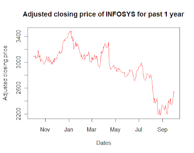
In my previous post, I employed a rather crude and non-parametric approach to see if I could predict the direction of stock returns using the function runs.test(). Lets go a step further and try modelling this with a parametric econometric approach. The company that I choose for the study is INFOSYS (NSE code INFY). Lets start by eyeballing the plot of the stock prices of INFY for the past one year.

## Set the working directory using setwd() ##
# Reading the relevant file.
infy <- read.csv("01-10-2010-TO-01-10-2011INFYEQN.csv")


# Plotting the past one year's closing price of INFY
plot(as.Date(infy$Date, "%d-%b-%y"), infy$Close.Price, xlab= "Dates", ylab= "Adjusted closing price", type='l', col='red', main="Adjusted closing price of INFOSYS for past 1 year")


Eyeballing the above plot suggests that the series is NOT second order stationary. Meaning that the first two moments, of the distribution from which the data is drawn, changes with time. For a stationary series, the mean doesn't changes with time and the co-variance with any "k" lag is independent of "t" and it just a function of "k". But we see that both the conditions are violated above. 


Let me attempt to explain the idea stationary in simple English language. For a moment suppose that you were to stand at time T = t and look at the value of the series, then look at the neighbors values to the left and right of "t", if by doing this exercise you can make out the value of "t" that you are standing at then it is possibly a non-stationary series. On the other hand if you were placed at time T = t in any stationary series, by doing the above exercise you would not be able to figure out the value of "t". (This definition came up during a discussion with Utkarsh some time ago). 


A rule of thumb in any time series modelling is that we work with only stationary time series. If the series exhibits any non-stationarity, we have to remove that before we can employ any empirical analysis. In the above series the non-stationarity can be removed by using the returns instead of actual stock prices. (analogous to First differencing) .


## Calculating the returns of stock prices 
infy_ret <- 100*diff(log(infy[,2]))  

## Plotting the returns
plot(as.Date(infy$Date[-1], "%d-%b-%y"), infy_ret, xlab= "Dates", ylab= "Returns percentage(%)", type='l', col='red', main="Daily returns of INFOSYS for past 1 year")


We see that in the above plot the mean is fixed at 0 and the fluctuations are around that mean, that doesn't change with time. Now that we have taken care of the non-stationarity lets proceed on our task. 


First we will plot the auto-correlation of the returns with the previous lags and see if there is any significant correlation that the returns have with the previous values.


## Plotting the ACF of INFY returns for the past one years
acf(infy_ret, main = "ACF of INFOSYS returns for past one year")


The blue dotted line is the 95% confidence interval. We can see that there is the 4th and the 7th lag significant in the ACF plot (there is one significant at 19th lag too but I choose to ignore that). Now lets see what I get if I regress the value of returns on the lagged values till lag 8th.


## Regressing the returns till the 7th lag
summary(lm(infy_ret[8:length(infy_ret)] ~ infy_ret[8:length(infy_ret) - 1] + infy_ret[8:length(infy_ret) - 2]+ infy_ret[8:length(infy_ret) - 3] + infy_ret[8:length(infy_ret) - 4] + infy_ret[8:length(infy_ret) - 5] + infy_ret[8:length(infy_ret) - 6] +infy_ret[8:length(infy_ret) - 7] ))## This is a simple OLS regression of the "inty_ret" starting from the 8th observation. I have started from the 8th observation to ensure that the number of obs. are same in the dependents and independent variables.


Output:
Coefficients:

                                 Estimate Std. Error t value Pr(>|t|)   
(Intercept)                      -0.09316    0.11321  -0.823  0.41140   
infy_ret[8:length(infy_ret) - 1]  0.08158    0.06479   1.259  0.20920   
infy_ret[8:length(infy_ret) - 2] -0.04017    0.06537  -0.614  0.53950   
infy_ret[8:length(infy_ret) - 3] -0.10049    0.06528  -1.539  0.12504   
infy_ret[8:length(infy_ret) - 4]  0.20153    0.06457   3.121  0.00203 **
infy_ret[8:length(infy_ret) - 5] -0.08566    0.06568  -1.304  0.19344   
infy_ret[8:length(infy_ret) - 6] -0.06849    0.06584  -1.040  0.29928   
infy_ret[8:length(infy_ret) - 7] -0.12395    0.06621  -1.872  0.06241 . 
---
Signif. codes:  0 ‘***’ 0.001 ‘**’ 0.01 ‘*’ 0.05 ‘.’ 0.1 ‘ ’ 1 

Multiple R-squared: 0.08717, Adjusted R-squared: 0.05998 

Only the coefficient of the 4th lag is statistically significant, and the Adjusted R-squared is a small 0.05998 (i.e ~ 6% of the explanation is provided by the above regression).


In the previous post we had reached the conclusion that the returns series is completely random (using runs.test()). But here we have fit in a model that provides ~ 6% of the explanation, the important question that needs to be addressed now is that the can we use this model to predict the stock returns (and make some money using a trading strategy that employs the above regression).


The model suggests that there is a statistically significant explanation that is being offered by the 4th lag in the above regression, but is this explanation economically significant? Now is when the economic intuition comes into play. The given sample data for the stock prices of INFY for the paste one year has confessed that the 4 days ago stock price provides a statistically significant explanation of today's stock prices. But a major point, perhaps the most important, that we are missing in the above model is the transaction costs or market micro-structures


Meaning that a statistically significant 4th lag does not mean that the explanation offered is economically significant too. To check if the relation is economically significant, we will have to adjust the prices for transaction costs and then do the regression and see if we get a similar result. Efficient market hypothesis that this statistical significant will disappear once you account for these transaction costs (impact cost or cost of trading). It seems to be intuitive too, because if we look at the ACF plotted above the auto-correlations are not significantly different from 0 and once we account for the transaction costs the 95% band will also broaden.

So the lesson is that a simple regression of current returns on the lagged returns (auto regressive model in time series parlance) might not be a reliable trading strategy :-)

P.S. In case anyone wishes to replicate the exercise the data can be obtained from here.


Sunday 23 October 2011

Principal component analysis : Use extended to Financial economics : Part 2

My previous post talked about how we can employ PCA on the data for multiple stock returns to reduce the number of variables in explaining the variance of the underlying data. But the idea was greeted with skepticism by many. A caveat to the application of PCA was that the meaning or the intuition behind the variable is lost in the computation of components, but since I was concerned with only explaining the variance in the underlying data it worked as a powerful method. This method was also adopted by Dr. Oyama in his research paper.

I came across this interesting research paper published in one of the most coveted journals, (International Journal on Finance and Economics) which has used the PCA on the macroeconomic variables. So relating it to my previous post and the question of investigating the factor affecting stock returns, what they do is that they take individual stocks and regresses it on the PCA of macroeconomic variables. At the first glance this would appear an inappropriate use of the tool, however the question that it intends to ask is also very different. There has been or infact still is this great battle between the Capital Asset Pricing (CAPM) school of thought and Arbitrage Pricing Theory (APT) school of thought. What the essential difference between these two schools is that the CAPM says that the returns to a stock are sensitive to only one factor, i.e the market rate of returns (single factor model) which captures the effect of all the various factors, however the APT guys scream that it depends on a number of factors and market rate of return would be just one of them. So in this battle to prove their point the APT folks take stock returns as a dependent variable and as independent variables they use the PCA of many macroeconomic variables. They do this essentially so that they can prove that there are more than one factors playing a significant part in the explaining the returns on a stock, they do not care whether the economic intuition is lost in the process on one-upmanship.

Well anything is fair in war, but I think this path taken by APT guys of proving their point is a fair point. The variables that are thrown into the PCA are chosen with an economic intuition in mind, so its not correct to say this entire methodology is flawed on the pretext that the PCA of these macroeconomic variables have no economics intuition. If one really digs into the intuition behind PCA as explained in this article one can visualize what the PCA of macroeconomics variables would be representing, the principal underlying components that give rise to such a macroeconomic series (signals). This is an unconventional way of doing an econometric study, as in this is more of a qualitative than a quantitative study. I cannot make sense of a statement that 1 unit increase in my first PCA results in "x" unit increase in returns, this is an absurd statement, but nevertheless the methodology of answering the underlying question is not absurd.

The methodology for calculating the PCA for macroeconomics is same as what was used in the previous post. We can have a number of macroeconomic variables, however, I have done this demonstration with only 2 variables change in Mumbai inter-bank offer rates (MIBOR) rates and change in INR/USD exchange rates.

#### Calculating the PCA of macroeconomic variables ####


# Reading the relevant files
mibor <- read.csv("MIBOR.csv", na.strings="#N/A")
exchange <- read.csv("Exchange_rates.csv", na.strings="#N/A")


# Making sure that there are no missing values in the data, the missing values are replaced by linear interpolation
mibor[, 2] <- approx(as.Date(mibor$Dates, '%d-%b-%y'), mibor[ ,2], as.Date(mibor$Dates, '%d-%b-%y'))$y   # approx() returns the interpolated values in column 'y'


exchange[, 2] <- approx(as.Date(exchange$Year,'%d-%b-%y'), exchange[ ,2], as.Date(exchange$Year, '%d-%b-%y'))$y  # Similarly for exchange rates


# Now we will have to compute the change in MIBOR and exchange rates:
for(k in 2:nrow(mibor))
{
  mibor$Change1[k] <- ((mibor$MIBOR[k] - mibor$MIBOR[k-1])/mibor$MIBOR[k-1])*100
}


for(j in 2:nrow(exchange))
{
exchange$Change[j] <- ((exchange$Exchange.rates[j] - exchange$Exchange.rates[j-1])/exchange$Exchange.rates[j-1])*100
}


# Creating matrix of the data
macro <- as.data.frame(rep(0, 2498))   


macro$ex <- exchange$Change
macro$rate <- mibor$Change1


macro.mat <- as.matrix(macro, nrow = 2498 , ncol = 2)

# Calculating the principal components 
prin.macro <- princomp(macro.mat)

barplot(prin.macro$sdev[1:2]/prin.macro$sdev[1])  # bar plot of the ratio is the standard deviation of the PC's with the standard deviation of the 1st PC, this can help us decide which PC to be used by simple eyeballing the plot.

# Extract the 1st PC in a variable
load1 <- prin.macro$loadings[,1]   # get the loadings of the 1st PC into 'load1'

pr.ma <- macro.mat %*% load1 # matrix multiply the loading with the original data to get the PC

pr1 <- as.numeric(pr.ma) # And 'pr1' has your first principal component. 

Now if you have read this article that I shared earlier, the first component gives me the principal underlying factor that gives rise to the series (signals) that I observe.

Caveats and cautions:

Before I am bombarded with question about the relevance of this methodology in this particular problem let me confess that in the above particular exercise its not the best idea to use PCA. One should use PCA only if one has many macroeconomic variables like M1, M3, CPI, IIP, WPI, etc and there is high correlation between them. I have done the above only for illustrative purposes (since I am not employing PCA on macro-variables in my project). 

Assuming I had other macro-variables in the calculation of my PCA above, I could use them as an independent variable and regress them on the stock specific returns to understand  if there are more than one factors that come out to be significant in this regression. What this would essentially mean is that are there more than one factors explaining the stock returns. For the finance students, this is the classic argument between the Capital Asset Pricing (CAPM) guys and the Arbitrage Pricing Theory (APT) guys. 

If in the regression of the PC's of macroeconomic variables on the returns we find that more than one factors are significant then we would have found evidence for or against one of the above theories.

Limitations in the above method:
  1. In the above exercise I have just taken 2 variables merely for illustration, I would have to include more variables if I really intent to find evidences against the CAPM.
  2. Again the caveat of interpretation applies. Its difficult to interpret the PCA on macrovariables

My take:

Despite of the above caveats I think PCA does a good job of giving us a good empirical way to answer the question of whether CAPM or APT is a superior asset pricing theory. The main idea behind these asset pricing theories is to see what factors need to be incorporated to compute the asset specific risk premiums, so on that front, its not difficult to see what people still stick to CAPM, as its a lot simple and easier to work with. APT on the other hand makes a bold assertion of multiple factors governing the returns but it has always found it difficult to list out these factors. Well in most cases you would be able to conclude that the returns can be modeled best using a multi-factor model, but whats interesting to ask is how much additional explanation is offered by factors other than the 1st one. If my multi factor model offers just a marginally higher adjusted-R-squared, is it reasonable for you to complicate your model is the question?

If it were only to prove this empirically why would you not choose the multi-factor model? The idea of modelling returns is to identify the factors that you need to take into account while computing the risk premiums, and if your factors do not have any economic intuition how can you assign risk premia looking at your principal component, that's the big question. But I would hate to impose my take here, further discussion is welcome.

P.S : In case you wish to replicate the above exercise you can find the data here, exchange rates, MIBOR

Friday 21 October 2011

Predictability of stock returns : Using runs.test()

Financial market is interesting place, you find people taking positions (buying/selling) based on their expectations of what the security prices would be and are rewarded/penalized according to the accuracy of their expectations. The beauty of financial markets is that it provides a platform for everyone to come in with their respective expectations and allows them to interact and exchange securities. I emphasize on everyone because this everyone includes a auto-rickshaw driver, a clerk and also sophisticated econometricians and analysts. An obvious point then is that if your expectations are consistently correct, i.e you can predict the price movements before it happens on the exchange, you are a rich man. Assuming for all practical purposes that there is no oracle in our universe, who can do these predictions with 100% accuracy, the job of this prediction rests upon an econometrician/statistician. Lets see if they can do a good job too.

I took the stock returns data for INFOSYS (INFY on NSE) for the past one year and tried to see if I could make this data confess its underlying linear/non-linear generating process. I started by employing a rather simple, straight forward and easy to interpret Runs test. Its a non-parametric statistical test that will test the null hypothesis of whether the underlying series is identical and independent distributed. For those who are not too familiar with statistical parlance, non-parametric in simple term means that we have to make no assumptions about what  the underlying data should be like. There is a huge surge in the applications of non-parametric statistics to explain various processes, this is because the biggest deterrence to conducting these kinds of tests, i.e the computational issues, are no longer a problem in this generation of rapid computation. The idea of empirical analysis is about trying to theorize a null hypothesis and then try your best to bring it down using empirical evidence. (analogous to Karl Popper's idea of falsification of a theory, you hang on to a theory so long as it has not betrayed you yet)

## Doing runs test on INFY daily returns
> infy <- read.csv("01-10-2010-TO-01-10-2011INFYEQN.csv")  ## Reading the stock price data


> infy_ret <- 100*diff(log(infy[,2])) ## Since the second column in the data has the stock prices I have used [log(Pt) - log(Pt-1)]*100 as the returns.
  
> runs.test(factor(infy_ret > 0))   ## what this has done is that it has created a category variable that takes value 1 of infy_ret > 0 and 0 otherwise. 

What this does is that tells me whether the runs of the returns are predictable, i.e say if I represent possitive return by + and negative return by - then my series of returns would probably look like +,+,-, +, -, -, -, +, ...
now that this test check is can I predict whether the next day will have  + or  -


Output:
Runs Test
data: factor(infy_ret > 0)
Standard Normal = 0.1308, p-value = 0.8959  ## High p-value means you cannot trash your null hypothesis. 

For those not familiar with statistics, the p-value is nothing but the probability of you reject a null hypothesis when it is actually true. So in simple words it gives me the probability that I might end up rejecting a correct null hypothesis. (be very careful with the interpretation of p-value, many times people end up misunderstanding it,  many a times even I have fallen prey to this). Therefore you cannot reject your null hypothesis under such a high probability of committing this error or wrongly rejecting a correct hypothesis , you just don't have enough evidence. Therefore your series is a random walk (you can understand this in the literal English language sense, but the definition is not so trivial in time series parlance).

P.S In case you want to replicate this exercise the data can be obtained from here.

Sunday 16 October 2011

Principal component analysis : Use extended to Financial economics : Part 1

While working for my Financial economics project I came across this elegant tool called Principal component analysis (PCA)which is an extremely powerful tool when it comes to reducing the dimentionality of a data set comprising of highly correlated variables. This tool finds majority application in genetic research, which deals with data sets having many variables that are highly correlated.


I will try and be as explicit and refrain from using statistical/mathematical jargons to explain what/how about this tool . To state a few stylized facts PCA is used mainly for:
  •  compressing the data
  •  filter some of the noise in the data

Problem at hand:

I was trying to investigate the factors that affect the returns of stocks in the Indian equity market, however I wanted to take into account all the S&P CNX 500 companies. What would be really nice if I could somehow find a way of squeezing the 500 companies into say not more than 2-3 variables that can be representative of the entire set of 500 companies. This is precisely where PCA comes into play and does a fantastic job. What it gives me is just 1 variable that I can use instead of all the 500 companies!!!

Hats off and a bow of respect for the contributors/donors of packages to the CRAN servers that the above simplification can be achieved using just one line of script in R. Sounds easy, but what one really needs to do is to understand what PCA does and how the output from this script can be interpreted. Again, at the risk of over simplication (however trying hard to maintain my commandment of simplicity), I would illustrate in a crude manner the working of PCA.

What PCA does:

Let me explain this relating to the above example, if I do a PCA on the returns data for the 500 companies, I would obtain 500 principal components. These components are nothing but the linear combination of the existing 500 variables(companies) arranged in the decreasing order of their variance. So 1st principal component (PC)has the maximum variance and 500th principal component (PC)has the least variance. The variance in the PCA represent nothing but the variance in the data. So 1st PC explains the maximum amount of variance in my data. One magical feature of PCA is that all these 500 components will be orthogonal to each other, meaning these components will be uncorrelated with each other. So essentially if we look at PCA as a black box it takes inputs as data set of highly correlated variables and gives as output PC's that explain the variance in the input data and they are uncorrelated with each other.(I don't leverage this feature in this particular problem, I would illustrate this use in other part of this blog)

How PCA does it:

Since I have taken a vow of simplicity, I dont have much to say here.:-) However for the mathematically inclined and certainty freaks like Madhav, this paper does a brilliant job of illustrating the matrix algebra that goes behind PCA computations. There are essentially 2 methods of calculating PCA, one is the eigenvalue decomposition (done using princomp() command in R)and the other is singular value decomposition (done using prcomp() command using R). 

How this can be done in R:

####### Calculating Principal component of returns of S&P CNX 500 companies ########
## Access the relevant file ##
returns <- read.csv("Returns_CNX_500.csv")

One caveat that you need to keep in mind in that there should be no "NA" values in your data set. A presence of an NA would impede the computation of the var-covar matrix and hence their eigen vectors(i.e the factor loadings)

## Dealing with missing values in the returns data for companies 
for(i in 2:ncol(returns))
{
  returns1[, i] <- approx(returns$Year, returns1[ ,i], returns$Year)$y  ## approx function basically fits the value of linear approximate between the missing data points and the column $y stores the approximated values.
}    

## Convert the data into matrix ##
ret <- as.matrix(returns1, nrow = dim(returns1)[1], ncol = dim(returns1)[2])

##Computing the principal component using eigenvalue decomposition ##
princ.return <- princomp(ret) ## This is it.!!

## Identifying what components to be used ##
barplot(height=princ.return$sdev[1:10]/princ.return$sdev[1])   ## I am plotting the standard deviation of the PC's divided by standard deviation of PC 1, this can help us decide on a benchmark that we can use to select the relevant components.

Standard deviation of the first 10 components compared to 1st PC

We can clearly see from the above figure that as expected the first PC does the majority of the variance explanation in the returns data for the 500 companies. So if we want to identify factors that influence the returns of S&P CNX 500 companies I can use the 1st PC as a variable in my regression. So far we have calculated the principal components, now we will extract out 1st PC as a numeric variable from the matrix.(princ.return)

## To get the first principal component in a variable ##
load <- loadings(princ.return)[,1]   ## loadings() gives the linear combination by which our input variables will be linearly weighted to compute the components, and this command gives us the loading for 1st PC.

pr.cp <- ret %*% load  ## Matrix multiplication of the input data with the loading for the 1st PC gives us the 1st PC in matrix form. 

pr <- as.numeric(pr.cp) ## Gives us the 1st PC in numeric form in pr.

One question that might be raised is why not just use the S&P CNX 500 index returns as an input to the regression? The simple answer to that question would be that PC 1 gives you a relatively clear signal of the returns as opposed to the index which would have a lot of noise. This question would have made sense in the 1900's when the technology was not so efficient in terms of computation. Since now computational time and effort finds minimum weight in any researchers mind there is no reason to settle for anything but the best.

There is an important caveat that must be kept in mind while doing analysis using PCA, though PCA has a clear mathematical intuition it lacks an economic intuition. That is, one unit change in PC 1 of returns has a mathematical meaning but no economic meaning, you cannot make sense of this statement that PC 1 of returns for the 500 companies has gone up by "x" amount. Therefore the use of this analysis should be limited to factor analysis and not to be extended to predictive analysis.

In case you wish to replicate the above exercise the data can be obtained from here.

Thursday 13 October 2011

Modelling with R: part 4

In part 3, we ran a logistic model to determine the probability of default of a customer. We also saw the outputs and tried to judge the performance of the model b plotting the ROC curve. Let's try a different approach today. How about a decision tree? For starters, we being a simple decision tree with no priors.


##########-------------2.2: Recursive partitioning------------###############         

## 2.2.1: Decision tree with no priors  ##

What is recursive? How is partitioning done? How does partitioning translate to predictions? What are priors? Let's try and decode these big words that we have written above.

Partitioning means splitting the data into subsets based on attributes. Partitioning typically happens in a top-down approach by choosing a variable, or an attribute, that is the "best" attribute to split the data. This "best" variable would be one that splits the data into homogeneous subsets with each subset having the same category of the target variable, i.e, either all zeros or all ones. It is in the way of choosing this "best" variable that different tree construction algorithms differ. For example, CART, uses Gini coefficient to choose the best variable. I read that ID3 and C4.5 use the concept of entropy, but I really don't know how these function.

After a subset is formed, the splitting process continues in a "recursive" manner and the recursion halts when the subset at a node has the same value for the target variable.

To run a decision tree we need to call the "rpart" library.
library(rpart)

We use a recursive partioning tree model to predict the likelihood of default.
t1.noprior <- rpart(default ~ 
                          amt.fac + 
                          age.fac + 
                          duration +
                          chk_acct +
                          history +
                          purpose +
                          sav_acct +
                          employment +
                          install_rate + 
                          pstatus +
                          other_debtor +
                          time_resid +
                          property +
                          other_install + 
                          housing +
                          other_credits +
                          job +
                          num_depend + 
                          telephone + 
                          foreign
                                , data = dev)
plot(t1.noprior)
# Plots the trees
text(t1.noprior)
# Adds the labels to the trees.

Before we score the validation data, we need to prune the tree to ensure that we haven't over fitted the data.
In order to prune the data we need to find the appropriate complexity parameter. The ideal value of the complexity parameter in this case would then be the one that minimizes the X-error.

We can find this value as 
printcp(t1.noprior)
# Here we see that the value is 0.013514.

We can write a small script to find this value
t1.noprior.cp <- t1.noprior$cptable[which.min(t1.noprior$cptable[, "xerror"]), "CP"]
t1.noprior.prune <- prune(t1.noprior,t1.noprior.cp)

We need to score the pruned tree model the same way we did for the Logistic model.
val$t1.yhat <- predict(t1.noprior.prune, val, type = "prob")

Now notice the difference between the two predictions- one of the Logistic model and the other of the tree model. The logistic model predictions have only column, which gives the probability that the person will default, or mathematically, the probability of y being equal to 1. On the other hand the tree model predictions give two columns, first for y being equal to zero and second column for y being equal to 1. Hence, for plotting the ROC curve we need to take only the probability of y being equal to 1.

We will also plot the ROC curve for this tree.
t1.scores <- prediction(val$t1.yhat[,2], val$default)
t1.perf <- performance(t1.scores, "tpr", "fpr")

# Plot the ROC curve
plot(t1.perf, col = "green", lwd = 1.5)

Now how do we compare the performance of this decision tree model with our earlier logistic model. One simple way would be to plot the two ROCs in the same graph and visually guess it.

# Add the ROC curve of the logistic model and the diagonal line
plot(m1.perf, col = "red", lwd = 1, add = TRUE)
abline(0, 1, lty = 8, col = "grey")
legend("bottomright", legend = c("tree", "logit"), col = c("green", "red"), lwd = c(1.5,1))

Similarly we can calculate the KS statistic as well
ks1.tree <- max(attr(t1.perf, "y.values")[[1]] - (attr(t1.perf, "x.values")[[1]]))
ks1.tree

Another way to compare the performance of two models, especially when the dependent variable is binary, is the Area Under the Curve or the "AUC"

# AUC for the logistic model
m1.auc <- performance(m1.scores, "auc")
m1.auc

# AUC for the decision tree
t1.auc <- performance(t1.scores, "auc")
t1.auc

Wednesday 5 October 2011

Modelling with R: part 3

The previous posts, part 1 and part 2, detailed the procedure to successfully import the data and transform the data so that we can extract some useful information from them. Now it's time to get our hands dirty with some predictive modelling.

The dependent variable here is a binary variable taking values "0" and "1", indicating whether the customer defaulted or not. There are specific, but many, modelling techniques that help us with binary dependent variables. Let's start with the one of the simplest, the Logistic Regression model. And this time, let's just dive straight into it and try to make sense as we go along.


##########-------------2.1: Logistic regression------------###############


m1.logit <- glm(default ~ 
                          amt.fac + 
                          age.fac + 
                          duration +
                          chk_acct +
                          history +
                          purpose +
                          sav_acct +
                          employment +
                          install_rate + 
                          pstatus +
                          other_debtor +
                          time_resid +
                          property +
                          other_install + 
                          housing +
                          other_credits +
                          job +
                          num_depend + 
                          telephone + 
                          foreign
                                  , family = binomial(link = "logit"), data = dev)
# The glm command is for "Generalized Linear Models"
# "~" is the separator between the dependent (or target variable) and the independent variables
# Independent variables are separated by the "+" sign
# "data" requires the data frame in the which the variables are stored
# "family" is used to specify the assumed distribution.


The above code is pretty much self-explanatory. We are running a logistic model on our transformed data. We have specified the "logit" link which means that the estimates (or coefficient or weights) will be for the log of odds ratio and not the direct probabilities. Additionally, note that in case we had to regress the dependent variable, "default" on all the independent variables, we could have simply written
# m1.logit <- glm(default ~ ., family = binomial(link = "logit"), data = dev)
Here the "." indicates all the variables in the data set except for the dependent variable. We are not using the command here is because we have the original "amount" and "age" variables as well as the transformed "amt.fac" and "age.fac" variables as well and we should use only one form, either the continuous form or the factor form but not both.

 We can check the output of the model as
summary(m1.logit)


You will see an output that looks like this
Call:
glm(formula = default ~ amt.fac + age.fac + duration + chk_acct + 
    history + purpose + sav_acct + employment + install_rate + 
    pstatus + other_debtor + time_resid + property + other_install + 
    housing + other_credits + job + num_depend + telephone + 
    foreign, family = binomial(link = "logit"), data = dev)

Deviance Residuals: 
    Min       1Q   Median       3Q      Max  
-1.9970  -0.7118  -0.3821   0.6864   2.5393  

Coefficients:
                  Estimate Std. Error z value Pr(>|z|)    
(Intercept)        0.36717    1.28298   0.286  0.77474    
amt.fac2600-5000  -0.39145    0.28742  -1.362  0.17322    
amt.fac5000+       0.25237    0.40440   0.624  0.53258    
age.fac30-40      -0.12406    0.26915  -0.461  0.64486    
age.fac40+        -0.40640    0.30975  -1.312  0.18950    
duration           0.03454    0.01152   2.998  0.00272 ** 
chk_acctA12       -0.26207    0.26204  -1.000  0.31725    
chk_acctA13       -0.71081    0.43527  -1.633  0.10246    
chk_acctA14       -1.66798    0.27841  -5.991 2.08e-09 ***
historyA31         0.51820    0.68122   0.761  0.44684    
historyA32        -0.44583    0.54524  -0.818  0.41354    
historyA33        -0.36003    0.58949  -0.611  0.54137    
historyA34        -0.89606    0.54235  -1.652  0.09850 .  
purposeA41        -1.30443    0.44483  -2.932  0.00336 ** 
purposeA410       -0.68765    0.79700  -0.863  0.38825    
purposeA42        -0.50703    0.31109  -1.630  0.10314    
purposeA43        -0.95899    0.29629  -3.237  0.00121 ** 
purposeA44        -1.07335    0.95318  -1.126  0.26013    
purposeA45        -0.40166    0.64852  -0.619  0.53569    
purposeA46         0.07051    0.48321   0.146  0.88399    
purposeA48        -0.79836    1.32004  -0.605  0.54531    
purposeA49        -0.63881    0.40523  -1.576  0.11493    
sav_acctA62       -0.20567    0.35346  -0.582  0.56064    
sav_acctA63       -0.29441    0.47750  -0.617  0.53752    
sav_acctA64       -2.03887    0.74864  -2.723  0.00646 ** 
sav_acctA65       -0.95937    0.32147  -2.984  0.00284 ** 
employmentA72      0.24498    0.51552   0.475  0.63463    
employmentA73      0.01948    0.50334   0.039  0.96913    
employmentA74     -0.41741    0.54075  -0.772  0.44016    
employmentA75      0.01317    0.50928   0.026  0.97936    
install_rate       0.22383    0.10671   2.098  0.03594 *  
pstatusA92        -0.71859    0.53450  -1.344  0.17882    
pstatusA93        -1.19509    0.52355  -2.283  0.02245 *  
pstatusA94        -0.95261    0.60277  -1.580  0.11402    
other_debtorA102   0.71012    0.48442   1.466  0.14267    
other_debtorA103  -0.84087    0.51928  -1.619  0.10538    
time_resid         0.06092    0.10684   0.570  0.56851    
propertyA122       0.43538    0.31755   1.371  0.17035    
propertyA123       0.45504    0.29062   1.566  0.11740    
propertyA124       0.95268    0.52675   1.809  0.07051 .  
other_installA142  0.54490    0.47279   1.153  0.24911    
other_installA143 -0.45903    0.28664  -1.601  0.10929    
housingA152       -0.58427    0.29480  -1.982  0.04749 *  
housingA153       -0.95369    0.59035  -1.615  0.10621    
other_credits     -0.08412    0.24145  -0.348  0.72753    
jobA172            0.51201    0.80390   0.637  0.52419    
jobA173            0.56316    0.77175   0.730  0.46556    
jobA174            0.09850    0.77019   0.128  0.89823    
num_depend         0.38802    0.29445   1.318  0.18758    
telephoneA192     -0.19916    0.24766  -0.804  0.42131    
foreignA202       -1.35004    0.85752  -1.574  0.11541    
---
Signif. codes:  0 ‘***’ 0.001 ‘**’ 0.01 ‘*’ 0.05 ‘.’ 0.1 ‘ ’ 1 

(Dispersion parameter for binomial family taken to be 1)

    Null deviance: 853.51  on 699  degrees of freedom
Residual deviance: 628.93  on 649  degrees of freedom
AIC: 730.93

Number of Fisher Scoring iterations: 5


We can see that we have five variables which are significant at 1 percent level of significance and one variable significant at 0.1 percent level of significance. Great! Or not so great! How do we judge how good/bad our model is? Have no fear, R is here.

One of the most popular methods to check the performance of a model, which has a binary independent variable, is by plotting the Receiver Operating Characteristic (ROC) curve which is a plot of the sensitivity, or the true positive rate vs. the false positive rate. In simpler terms, it plots the no. of 1s in the model correctly identified as 1 vs. the no. of 0s in the model which are incorrectly identified as 1.

Also, it makes more sense to plot the ROC curve on the validation sample. For this, we would need to score that validation data set. By "scoring" we mean that with the values of the independent variables given in the validation sample, we will run the model equation on each row of the data set and get the probability of the customer defaulting. Simply, use all the Xs and the Y-hats or the predicted Ys.
val$m1.yhat <- predict(m1.logit, val, type = "response")
# The predict command runs the regression model on the "val" dataset and stores the estimated  y-values, i.e, the yhat.

library(ROCR)
m1.scores <- prediction(val$m1.yhat, val$default)
# The prediction function of the ROCR library basically creates a structure to validate our predictions, "val$yhat" with respect to the actual y-values "val$default"

We can then plot the ROC curve by plotting the performance fuction which checks how our model is performing.
plot(performance(m1.scores, "tpr", "fpr"), col = "red")
abline(0,1, lty = 8, col = "grey")
# "tpr" and "fpr" are arguments of the "performance" function indicating that the plot is between the true positive rate and the false positive rate.
# "col" is an argument to the plot function and indicates the colour of the line
# "abline" plots the diagonal, "lty" is the line type which is used to create the dashed line

The ROC curve's performance is judged by the area under the curve formed by the ROC curve and the 45' line. The idea is that if we randomly try to classify the customers who will default, we will get the 45' line. And if we use a predictive approach, then the approach should try to classify all the 1s and 1, i.e, correctly identify all the people who defaulted. Such a curve would then be a right triangle with vertices at (0,0), (0,1), (1,1). But since predictive modelling is usually accompanied with some error, we get a curve like we see in the graph. And the rule of thumb is, more the area under the curve, better the model.

In addition to the ROC curve, the KS statistic is also a popular metric used to judge model performance, the Kolmogorov-Smirnov statistic. It is the maximum difference between the cumulative true positive rate and the cumulative false positive rate

For this let's store the output of the "performance" function above to an R object
m1.perf <- performance(m1.scores, "tpr", "fpr")
ks1.logit <- max(attr(m1.perf, "y.values")[[1]] - (attr(m1.perf, "x.values")[[1]]))
ks1.logit


Well, the ROC shows that the model is not so great but not so bad either. So what do we do to improve our model? Do some more transformations, tweak it a bit, or just try a different technique?


I'll leave this as an open question to make it interactive. Let's try all the "feasible" approaches that people suggest that will help us improve the model.                 
               

Tuesday 4 October 2011

Simple time series plot using R : Part 2

I would like to share my experience of plotting different time series in the same plot for comparison. As an assignment I had to plot the time series of Infant mortality rate(IMR) along with the SOX emission(sulphur emission) for the past 5 decades in the same graph and compare how the intensities have been varying in the past 5 decades.Well to start with there is a problem of how to get these plots in the same graph as one is a mortality rate and other is an emission rate, having different units of measurements!


What we essentially want to do is to see how the intensity of these problem has been changing, whether the intensity has increased/decreased. From a policy makers standpoint, whether it requires immediate attention or not. So what we can do instead is divide all the IMR values by the maximum IMR value that we have for the past 5 decade and store them as "IMR.std". Similarly divide all the SOX values by the maximum SOX value and store it in "SOX.Std". What we have achieved is a parsimonious way of representing the 2 variables that have values between "0 and 1".(Achieving the desired standardization).


Now that we have "IMR.Std." and "SOX.Std." both with values between "0-1" I can plot them in the same graph. Recalling from the previous post


# Make sure the working directory is set to where the file is, in this case "Environment.csv":


a <- read.csv("Environment.csv")


# Plotting the "IMR.Std" on a graph


plot(a$Year, a$IMR.Std., type="l", xlab= "Years", ylab= "Intensity of problem(normalized between 0-1)", col="green" , lwd=2)


# Adding the plot for "SOX.Std."
# lines(...) command basically adds the argument variable to the existing plot.


lines(a$Year, a$SOX.std., type="l", col="black", lwd=2)


Ideally this should have done the job. Giving me the IMR.Std(in green) and SOX.Std.(in red) in the same plot. But this dint happen for the reason that the data for SOX was available only after 1975 and also the data was not available for alternate years. Well I thought that R would treat it trivially and just plot the "non-NA" values of SOX.std. that were there but as it happens that this was not such a trivial thing for R. It demands a lot more rigor(just like a mathematical proof), to execute a command, not taking anything for granted. Hence to get the desired result I had to specify that it considers only the "non-NA" values for SOX.Std.


The code for SOX.std had to be altered a bit:


a <- read.csv("Environment.csv")


plot(a$Year, a$IMR.Std., type="l", xlab= "Years", ylab= "Intensity of problem(normalized between 0-1)", col="green" , lwd=2)


# All I need to make sure now is that I direct R to refer to only the "non-NA" values in the SOX.Std. variable.
lines( a$Year[ !is.na(a$SOX.std.) ], a$SOX.std.[ !is.na(a$SOX.std.) ], type="l", col="black", lwd=2)


# If there are 2 separate graphs on the same plot to label the different graphs(depending on their color in this case) we use the legend(...) command :


b <- c("IMR rate", "SOX")
legend("bottomleft", b , cex=0.8, col=c("green", "black"), lwd=2, bty="n")


# title(...) command gets a main title to the plot
title(main="Stage model for country X", col.main="Black", font.main=4)


This is how the plot finally looks like.


It was Utkarsh's generosity, who gave me the codes, that saved me a lot of time in solving this small issue, I wish to pass this on as it might save someone else's.